COFFEEPHARM branding strategies KOREA CAFE

When comparing the branding strategies of typical independent cafés and COFFEEPHARM, the difference lies in their fundamental approach. Most independent cafés tend to settle with the idea that “as long as the interior looks nice and the coffee tastes good, that’s enough.” In contrast, COFFEEPHARM has established a comprehensive brand system—from brand philosophy to visual language and operational methods.
More than 80% of independent café startups in Korea are run by self-employed individuals. For these businesses, priorities often lie in rent, interior design, barista training, and equipment selection, rather than design, branding, or storytelling. On the other hand, COFFEEPHARM’s branding is built upon a unique worldview inspired by pharmaceutical quality control (QC) systems, setting it apart in terms of depth and execution.
Typical cafés target local residents and walk-in customers from social media exposure. COFFEEPHARM, however, not only includes these demographics but also targets enthusiasts who resonate with its concept, health-conscious consumers, and those who value strong branding. A clearly defined target leads to a clearly defined brand direction.
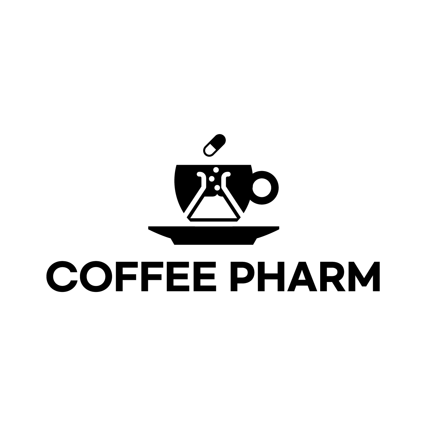
COFFEEPHARM Logo
The logo comprises a coffee cup, a laboratory flask (Erlenmeyer flask), a pill, a saucer, and the brand name “COFFEEPHARM.” Rather than representing just another coffee brand, the logo visualizes a scientific and pharmaceutical approach to coffee and quality control.
COFFEEPHARM is a coffee brand inspired by the quality control systems used in pharmaceutical companies. It treats coffee as more than just a lifestyle beverage, taking a scientific approach to ingredients, quality, and extraction consistency—essentially analyzing coffee as a “product.” This brand philosophy is accurately captured in the logo.
In contrast, independent cafés often have inconsistent logos, signage, and menus or rely entirely on their interior designers. COFFEEPHARM’s logo alone reflects deep philosophical symbolism (pharmaceuticals + experimentation + coffee), and the brand has thoughtfully expanded its identity into QC LAB, figures, pens, lab coats, and other related goods and content.
-
Creativity: ★★★★★ (The combination of flask and pill is rare)
-
Clarity: ★★★★★ (Concept easily understood at a glance)
-
Brand Consistency: ★★★★☆ (Well-aligned with QC LAB and goods)
-
Scalability: ★★★★★ (Seamlessly applicable to merchandise, packaging, and store interiors)
-
Balance of Emotion & Functionality: ★★★★☆ (Slightly tilted toward science, but this adds uniqueness)
Symbol – OK HAND Gesture
What first catches the eye is the 'OK' hand sign, with three fingers raised and the index finger and thumb forming a circle. But this is more than just a simple gesture. The fingers curve downward, and the palm’s central curve mimics the shape of a coffee bean.
This symbol, therefore, blends two meanings:
-
The OK Sign: A universal gesture representing "quality approved," "passed," or "in good condition"
-
The Bean + Experimental Curve: Illustrates the organic flow of coffee quality and scientific inspection
Ultimately, this gesture symbolizes the philosophy of QC LAB: “We inspect coffee and provide an OK only when it passes reliable analysis.”
Why do most independent cafés struggle with branding?
-
Lack of Resources: There’s little room in the budget for design or branding; most of it goes to rent, beans, and equipment.
-
Lack of Know-how: Many owners either don’t understand the importance of branding or don’t know how to implement it.
-
Low Awareness of Differentiation: Many believe, “As long as I make the coffee myself, that’s good enough.”
-
Short-Term Profit Focus: Immediate revenue often takes priority over long-term brand value.
-
Externally Designed Brands: When all branding is outsourced to consultants or designers, the result often lacks philosophical depth.
Are there other cafés that brand themselves like COFFEEPHARM?
Among independent (non-franchise) cafés, it’s rare to find a business with a well-defined brand philosophy and consistent visual/operational systems like COFFEEPHARM. While some Instagram-friendly cafés do put effort into branding, few integrate philosophy and operation as a unified system.
COFFEEPHARM stands out as a unique case where branding is approached not through mere aesthetics but through philosophy and strategy. It has established a rare and unmatched position within Korea’s independent café scene.


Comments
Post a Comment